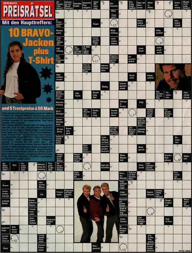
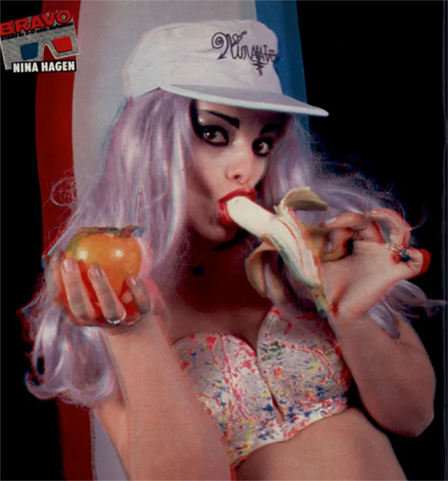
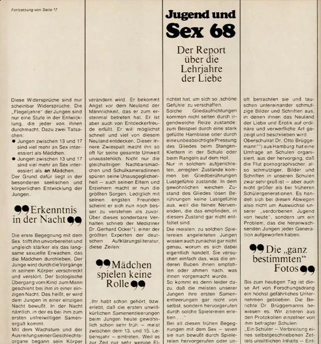
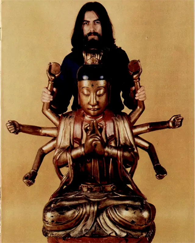
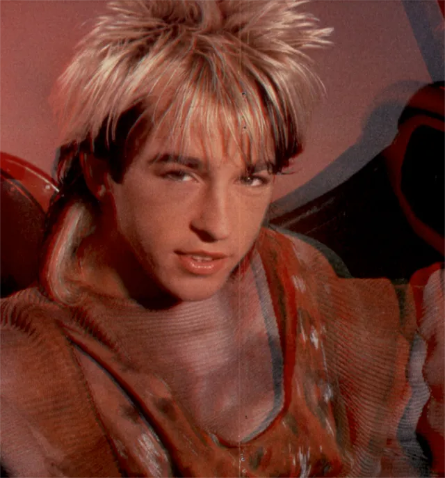
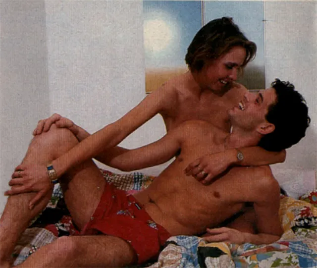
In the 4th semester, I participated in a seminar called “Text-Bild-Kontakt” (tbk), where we explored the relationship between text and visual material in print products using some kind of base material. After considering different options as my reference, I decided to work with the “Bravo-Archiv” – the archive of Bravo, one of the biggest teen magazines in the German-speaking region, covering topics like trending music, early love life, and all kinds of gossip. The archive dates back to 1956, and ranges from strange portraits and controversial ads to engaging headlines and unexpectedly interesting topics – ready for a fresh design approach.
design
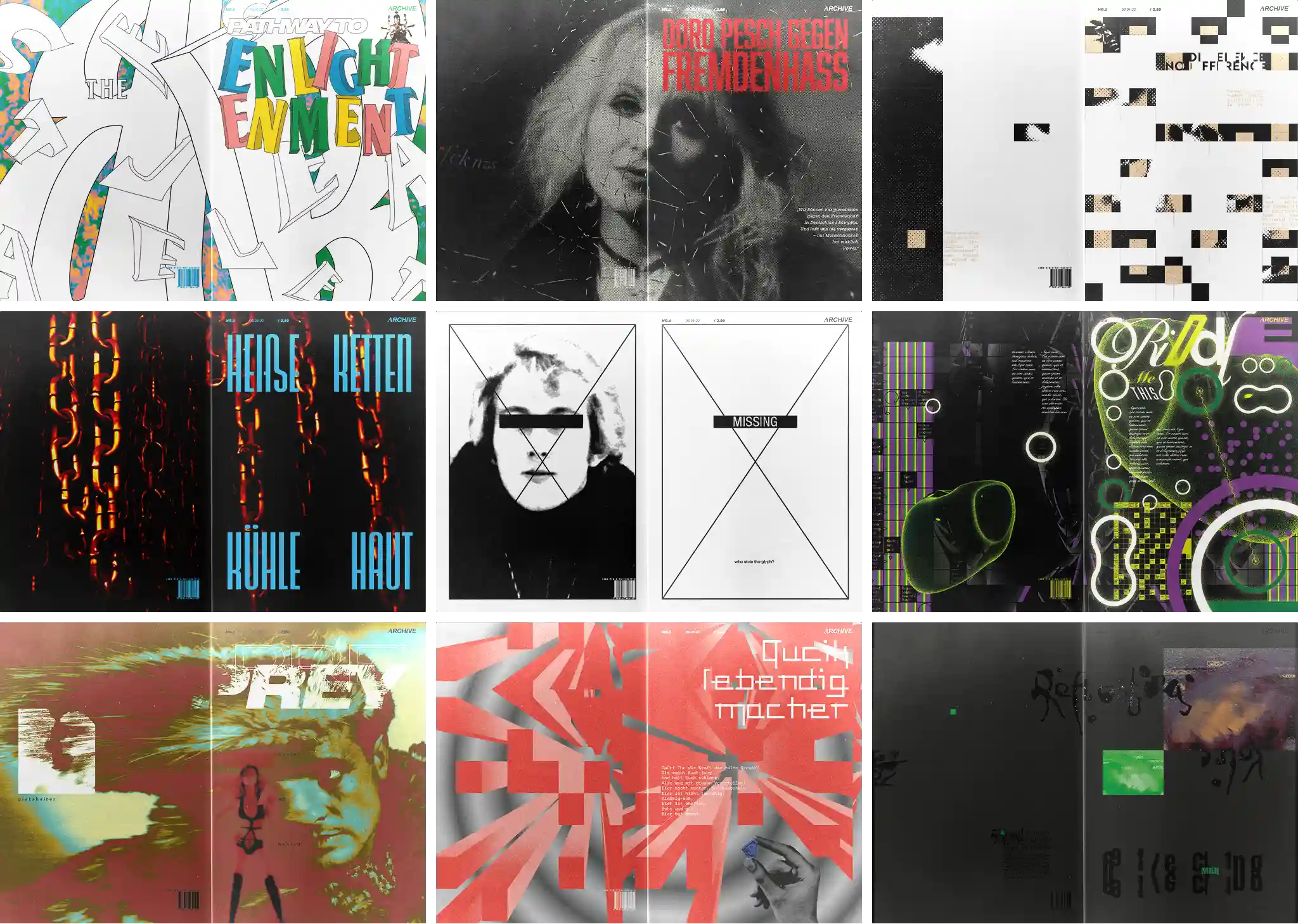
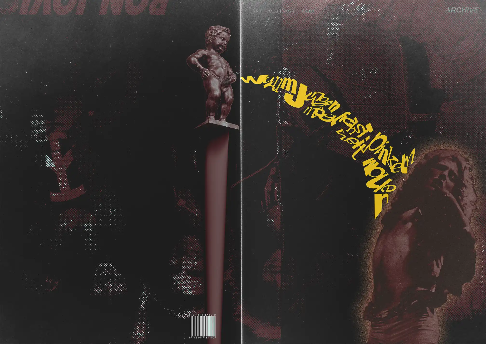
I named the series “Archive”, drawing inspiration from the “Bravo-Archiv.”
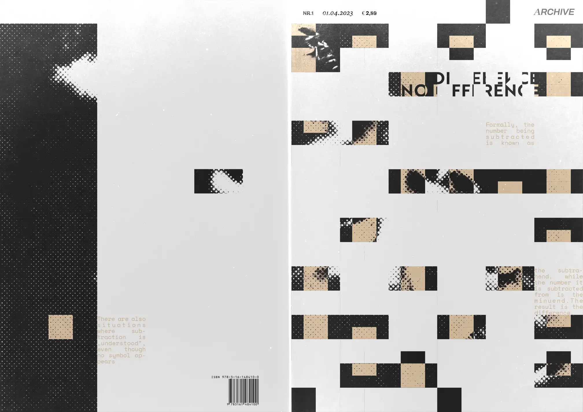
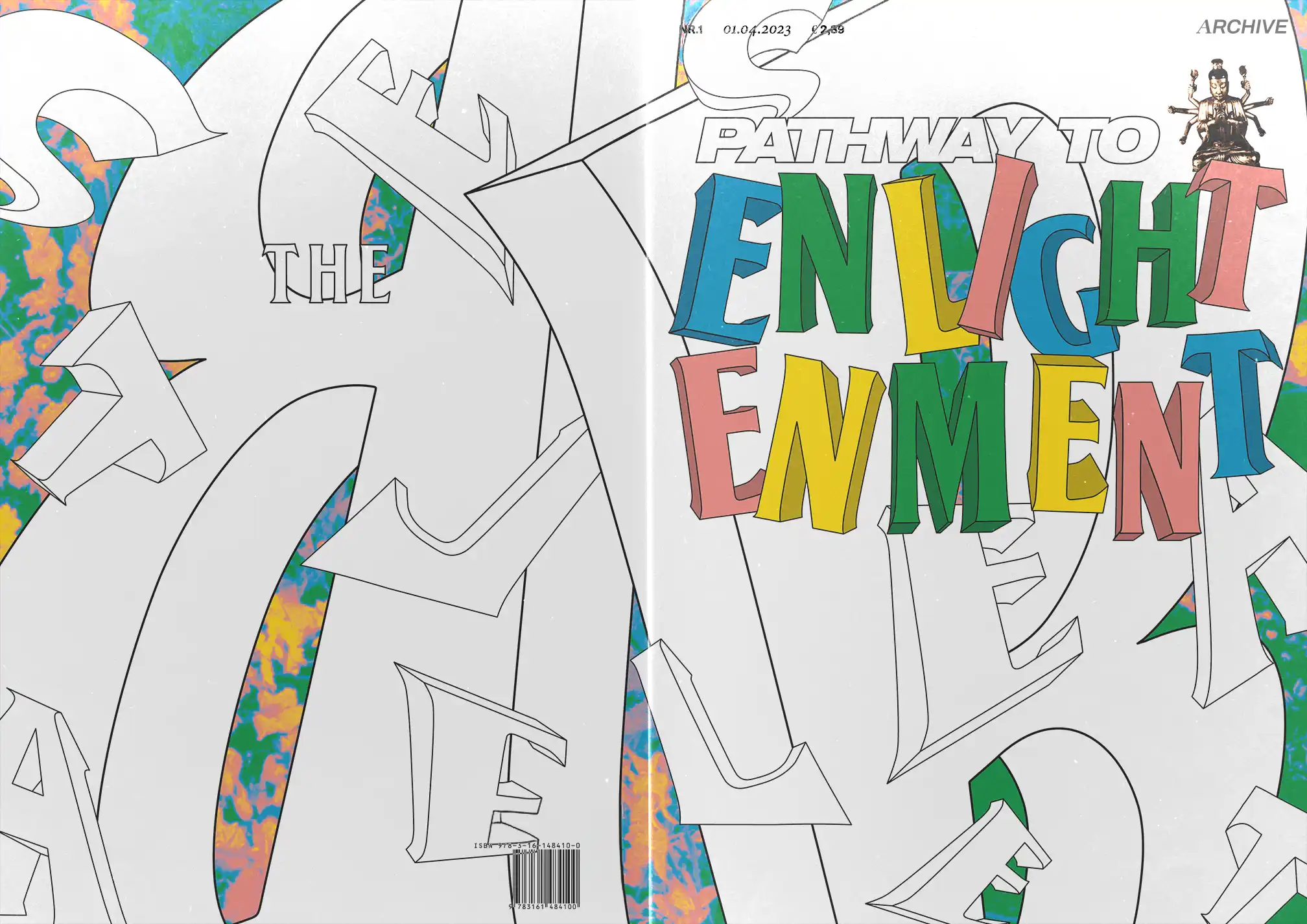
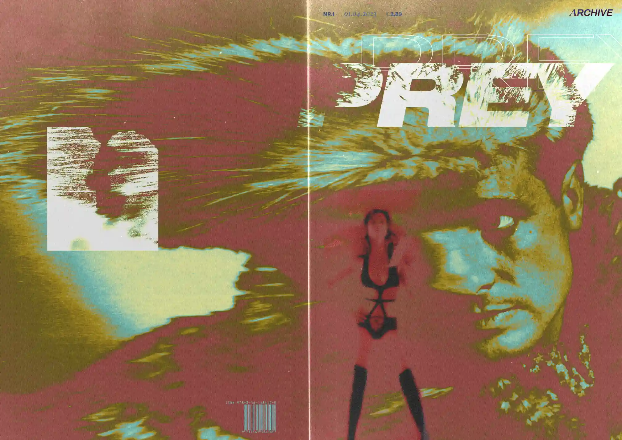
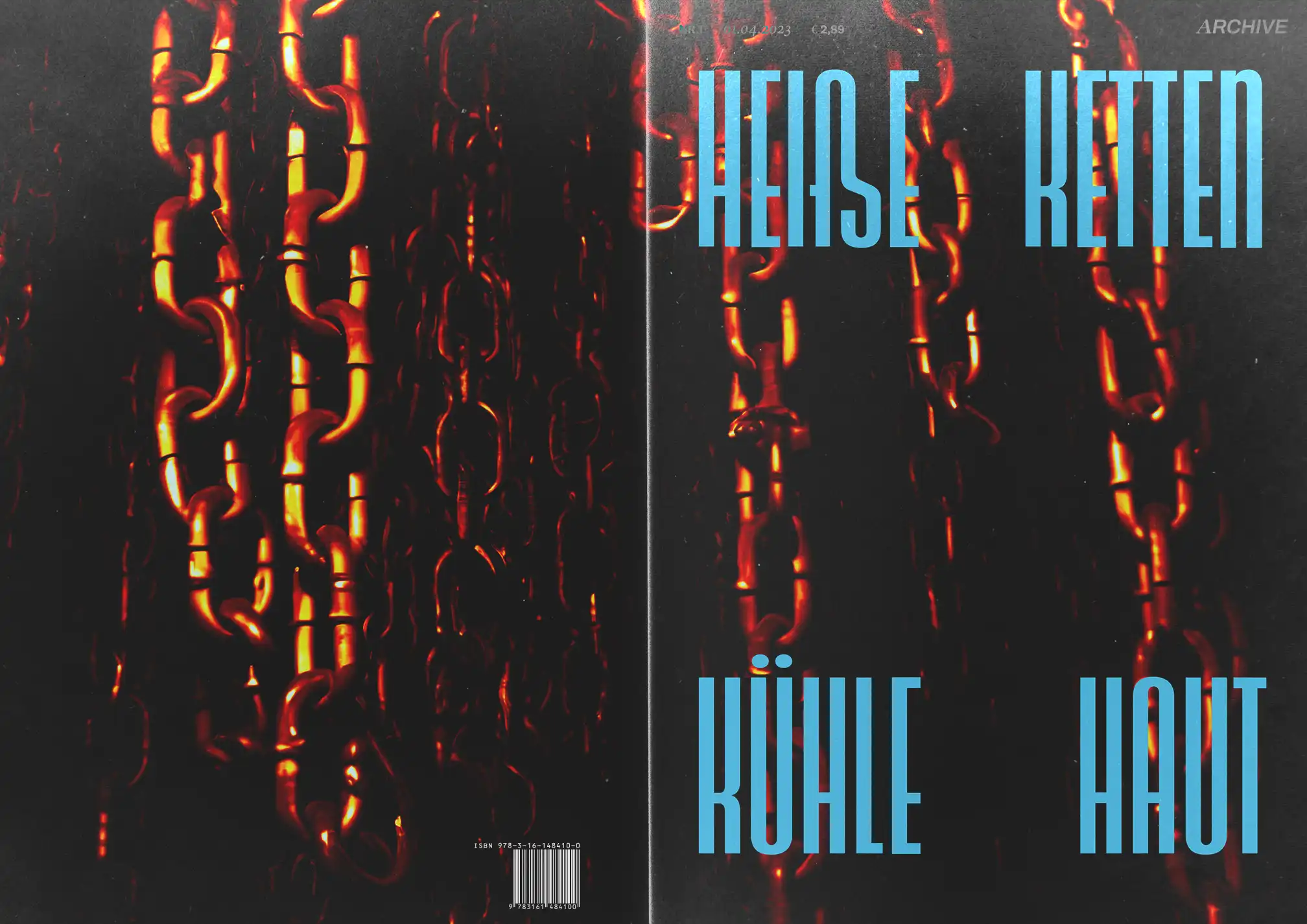
As my medium I stayed with the magazine covers – as an obvious choice given my source of material. I tried to create a cohesive design including not only the frontside cover of the magazine but also the backside.
The logo itself was a mix of old and new, combining a classic serif font with a modern grotesque typeface. The whole design played with the contrast of retro and contemporary elements I chose to transport through the designs.
The original Bravo covers had the look of a TV guide, stuffing as much information as possible into one layout. They used multiple colors, different fonts in various sizes, and often felt chaotic. I wanted to reflect the spirit of these covers but with a modern twist, simplifying the overloaded design while still preserving the magazine’s essence. The result was a series of cover-designs that balanced the nostalgic feel of the original Bravo with a contemporary, and mostly cleaner aesthetic and preserved some – and at times created even more weirdness.
process
I often included contemporary topics which were already discussed in Bravo issues from back in 1956. Sometimes this gave the possibility to really reflect on the social development of the youth and what was improved on and what remained the same in the last 50 to 60 years. This made the creation process quite easy because the narratives shown to me in the archive often were so thought-provoking – sometimes even shocking, but also really funny – that the themes of the designs created themselves.