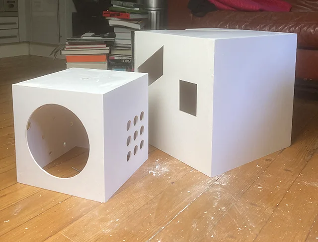
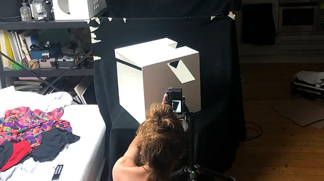
In our fourth semester, a friend of mine and I took part in a seminar about designing a more or less fictional annual report for a company of our choice. A few years earlier, I had come across one of Stefan Sagmeister’s iconic annual reports for the Zumtobel Group AG – which I really liked and felt inspired by to choose them for our project as well. The Zumtobel Group consists of four companies, all dedicated to different types of lighting systems used in museums, workplaces, and others. Since light was the obvious design focus, we wanted to create an approach that highlights its fundamental role in spatial perception. We were especially captivated by how essential light is for fully understanding two and three-dimensional space – so much so, that we decided to build our entire design concept around it. Given the topic, we decided to strongly abstract and amplify the effect of light through photography by focussing on creating strong contrasts and using bold colors. However most of our layout relied on white elements on a black background, with color accents coming exclusively from our images.
images
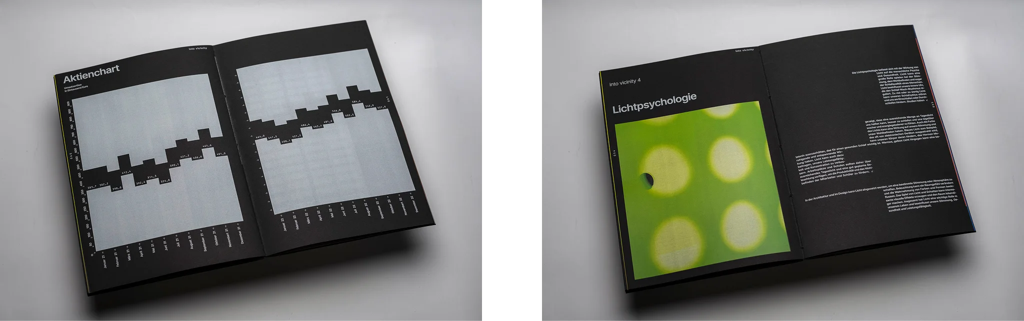
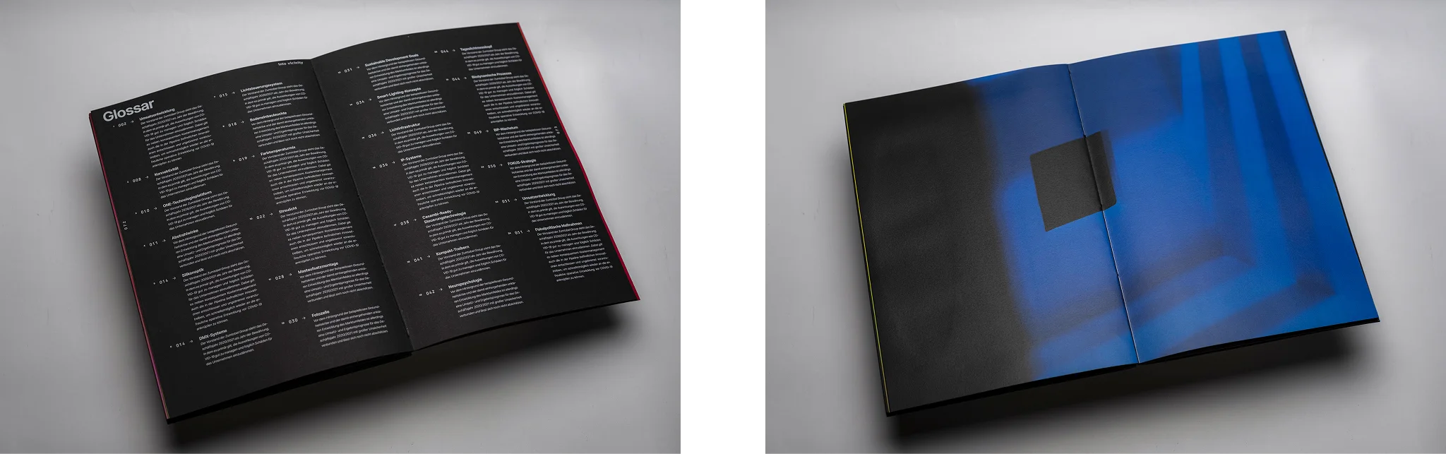
We felt that the abstraction of space in some images, paired with others that showed clear edges and highlighted how light passed through our cut-outs, needed to be emphasized in the report. Our goal was to create a clear focus in these sections of the print, staging our theme of spatial perception, while also allowing them to set themselves apart from the other informative content. These highlight pages were meant to make an impression with striking colors in the photography, as well as with dynamic and expressive text layouts.