The magazine Future Dreams revolves around one big question: How do we want to live? A big part of that is exploring what “home” really means – especially in a world that’s becoming more flexible and globalized. For people like digital nomads, home isn’t always a fixed place. It’s shaped more by personal values, a sense of community, and the flexibility to move. That raises important questions: What makes us feel at home? How do we retain the concept of being home when our lives are constantly in motion? With this in mind, the interview in the magazine was designed to ask exactly that. The goal wasn’t just to ask where someone feels at home, but to explore emotional connections, responsibility, and how identity is tied to places and people. In my conversation with digital nomad Nadine Schwery, I wanted to understand how she sees “home” as something fluid – and what role her experiences and values play in that. Rather than chasing a single definition, the aim was to open up space for reflection. How do we each define belonging in the future? What does home look like when it’s no longer one place, but a feeling or a set of guiding principles?
design
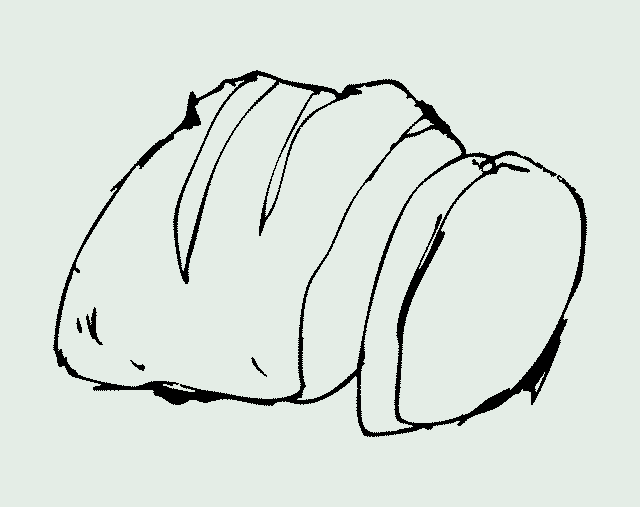
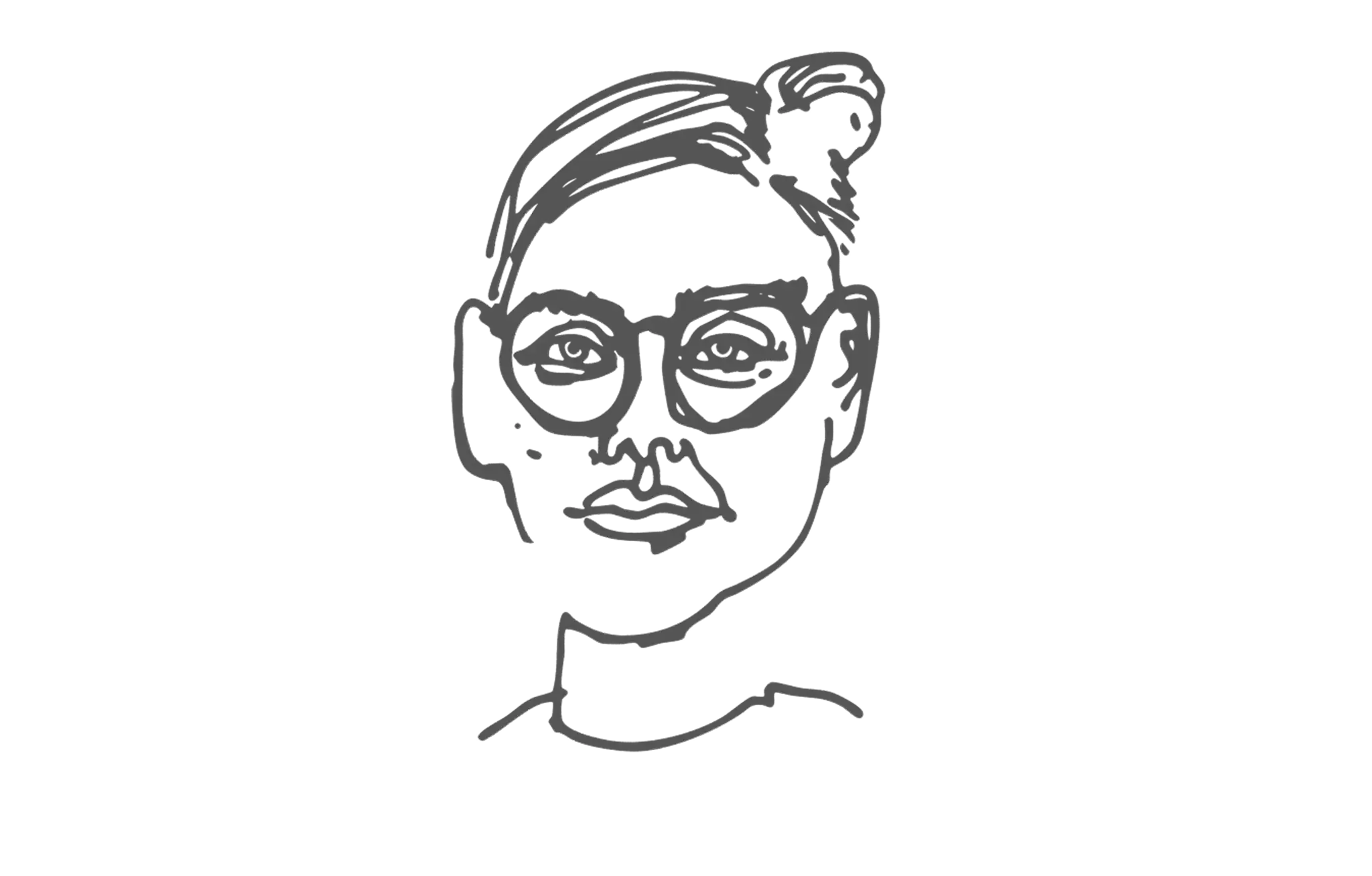
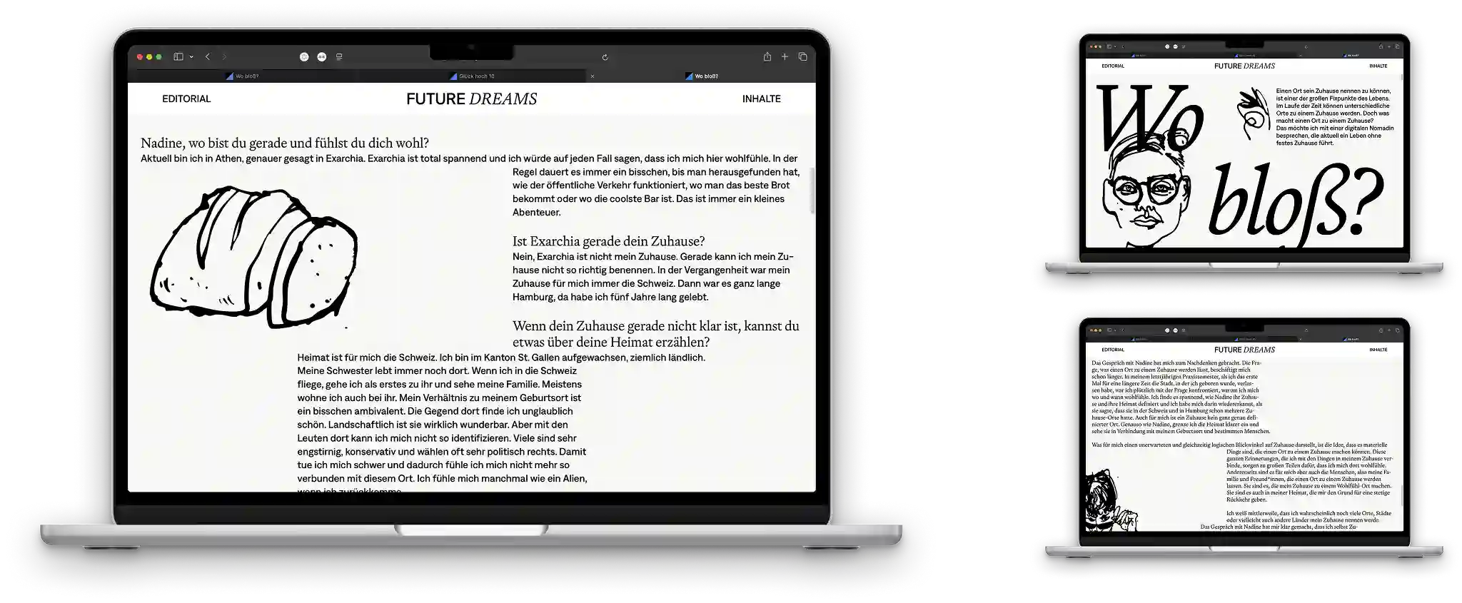
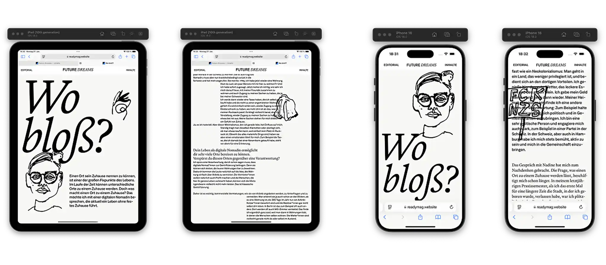
The final design of the article followed a minimalist yet expressive aesthetic. The text was set in a reader-friendly grotesque typeface, while the questions were displayed in an elegant yet informative serif font. In a few places, lines broke out of the strict typesetting, linking different parts of the interview. The visual focus was on simple illustrations – made by my good friend and illustrator-by-choice Noah Oetelshofen – image-traced in Illustrator and animated as simple wiggling GIFs.
These animations added movement to the layout, appearing horizontally on scroll and referencing key themes from the interview. The vector-style image trace gave the visuals a seamless connection to the typography, almost blending image and text into one cohesive mass at some points. A limited coloration reinforced the clean look. While the original plan involved more color, I ended up choosing a more restrained approach to keep the focus on the content – and on the subtle motion of the animations.
The result was a visual narrative that resembled the topics of the interview without overpowering them. The options were limited but this strict but dynamic text layout engaging with the animated GIFs gave a nice feeling to the story.
It was fun working with classic graphic typesetting in a medium such as a digital magazine. This gave me the opportunity to explore my abilities to guide along digital text in a more playful way, than just plain justified text.
What was also an important learning for me was the journalistic and conceptual approach. I was guided to really think through the concept and structure of the interview, which was new to me in this level of thoughtfulness and depth.