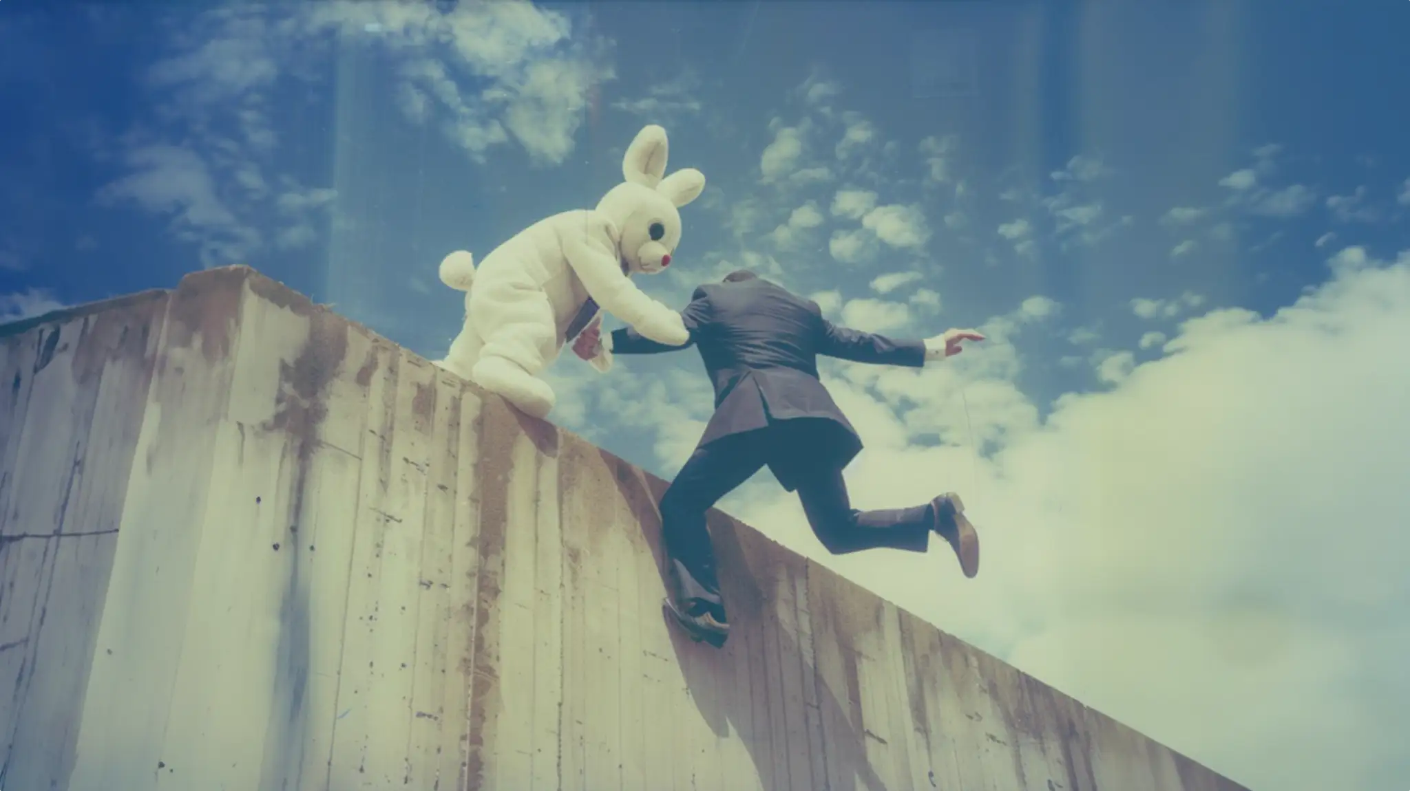
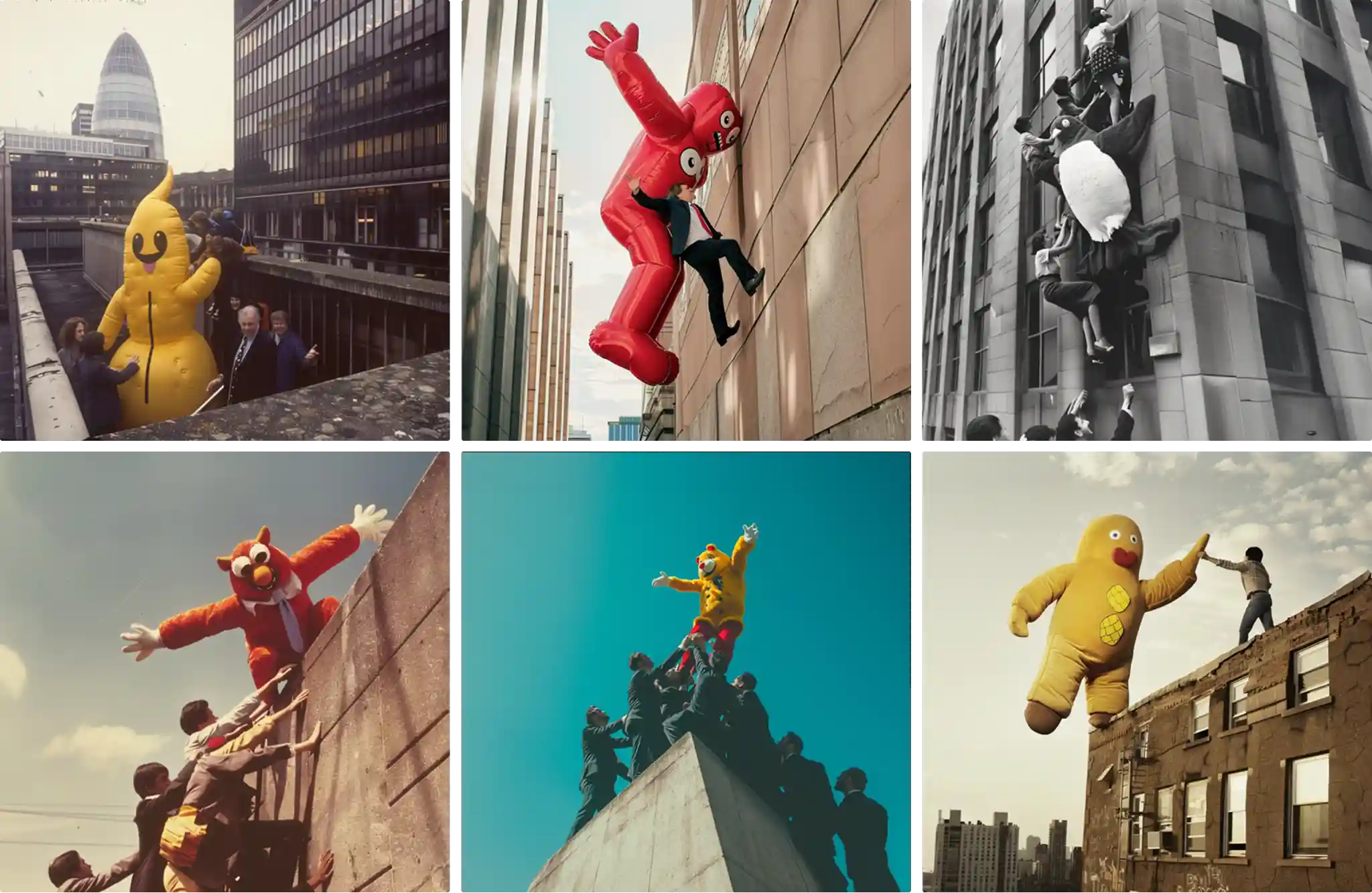
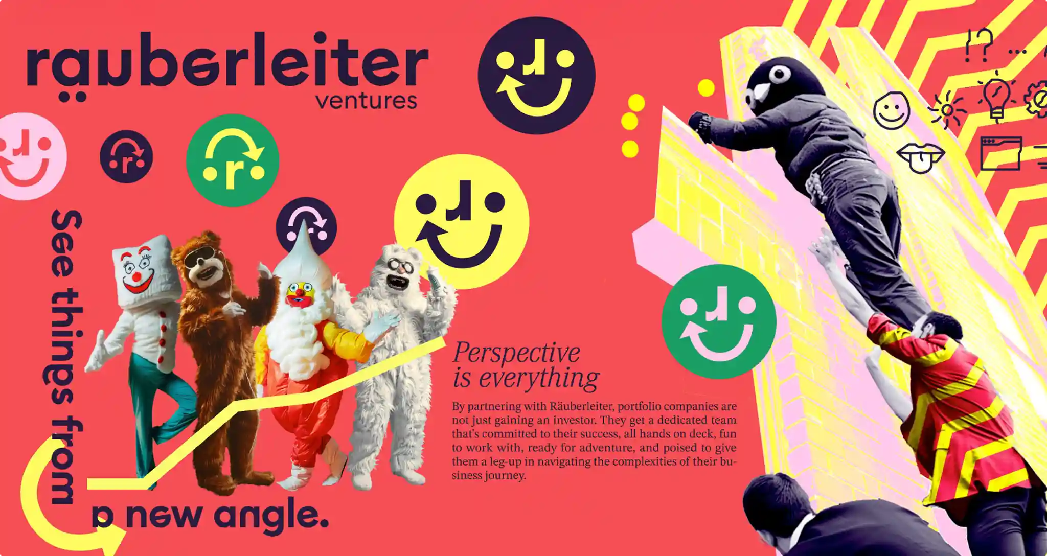
The managing directors of Räuberleiter – a venture and consulting company – had already worked with Rocket & Wink on an earlier project. This time, they approached the team for the branding of their new firm. Together with a positioning agency, they had already developed the core narrative: helping businesses overcome challenges – like giving someone a leg up over a fence. The goal was to bring this narrative into the design. The one of the four routes I worked on directly visualized the idea of a leg-up: using AI, we created images of retro advertising mascots from the ’70s and ’80s helping suited businesspeople over obstacles. Another key aspect of their brand positioning was a sense of mischief – so the overall visual language aimed to reflect that playful, cheeky spirit across all design assets.
design
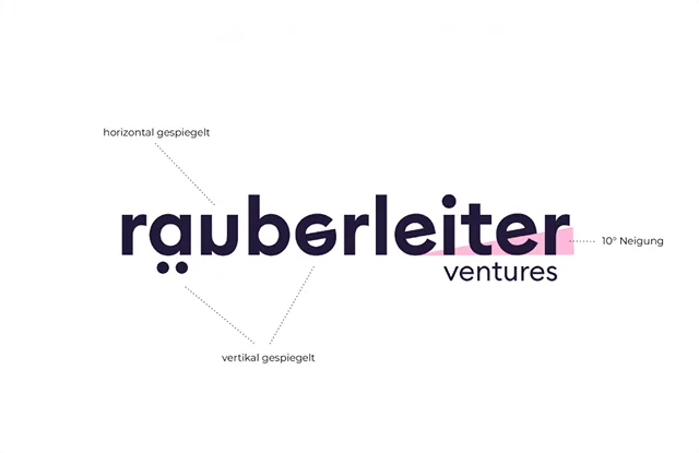
The logo tried to encapsulate the idea of turning a business on its head or looking at it from a different perspective. The typeface was a pretty standard kind of geometric grotesque, chosen to contrast the playful typesetting.
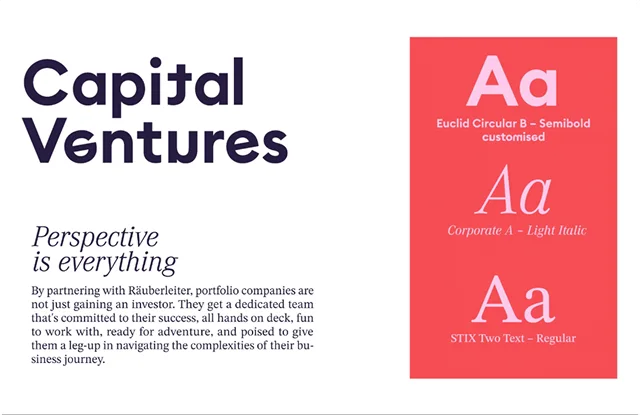
The colors gave the brand an energetic and fun vibe, underlining its mischievous spirit – something not typically seen in this otherwise conservative field.
The flow text was meant to balance out the playfulness – focusing on clarity and readability while still fitting consistently into the overall design.